Last week my hard drive died on my laptop. The worst part about this was my lack of backing up my data. I really lost a lot of data. I have spent about two days now reinstalling my programs, updating them, and configuring my system to get it back to the state it was prior to my hard drive failure. Even after I get everything up and running the way it was, I will still be with out a bunch of files that I was working on.
I am writing this as a reminder to everyone to backup your data regularly. I always heard the saying, there are two type of people. One that backs up their data, and one that will after they lose their data. I never paid much attention to it since I have never hard a problem. Now that I have learned the hard way, I will be backing up quite often.
Monday, March 31, 2008
Thursday, March 27, 2008
Photoshop Express is Here!
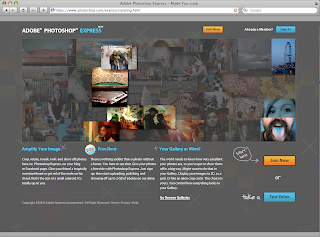 (Note: the previous post regarding this is available here.)
The long-awaited, much-discussed beta of Adobe Photoshop Express is now available online. This is the next evolution for Adobe, taking the big leap forward into Rich Internet Applications. Not only can you now upload your photos onto the net and edit directly in your browser, there will also be an Adobe AIR based desktop version forthcoming.
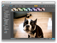 Editing could not be easier, since Adobe has done the work for you. Please note that this is never going to replace the full version of PS, it is more focused on consumer use (mom & pop). The controls are easy to understand and the visual interface is damn sexy (even if the demo photos are not - ha).
Controls for basic corrections include Crop & Rotate, Auto Correct, Exposure (levels), Red-Eye Removal, Touchup (the healing tools), and Saturation.
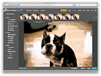
Then there are "Tuning" controls - White Balance, Highlight, Fill Light, Sharpen or Soft Focus effects. Each of these begin to customize your photo.
The final set of tools are the Effects tools, which include Pop Color, Hue, Black and White, Tint, Sketch (preset filter gallery effects) and Distort.
After all is said and done, people can argue that this is "Photoshop Lite" or "for Dummies" but I think this is a great direction to take the Photoshop Family and expose the masses to what is possible using Adobe products, not only Photoshop but their Flex and Air applications as well.
Wednesday, March 26, 2008
FAQ: Final Cut Pro: Transitions
One of the most common questions I get from former students in Final Cut Pro is this:
How come sometimes I can't put my transition in the place that I want it? (see pic)
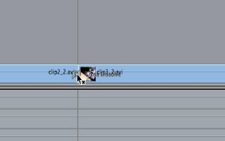
Well, while there could be a couple of reasons, the most common reason is due to "handles" on the media.
Imagine it like this.
The way a transition works, in this case the cross dissolve, it grabs the 15 frames before and after the edit point for both clips to create an evenly fading transition.
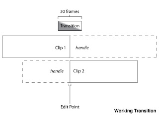
Since there is available data on either side, Final Cut Pro will use these frames to form part of the transition, although you originally edited this out. So be warned, if you are using transitions, be mindful of what is in this handle. There is probably a reason you edited it in the first place.
You may come across flashes of other shots, or an errant clapper, because of this.
If you have two clips together that do not have an extra 15 frames in either direction, then this transition cannot occur.
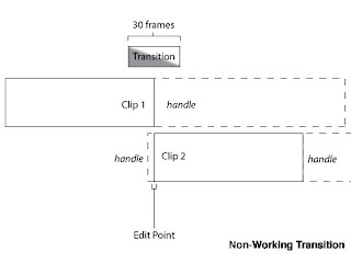
How come sometimes I can't put my transition in the place that I want it? (see pic)

Well, while there could be a couple of reasons, the most common reason is due to "handles" on the media.
Imagine it like this.
The way a transition works, in this case the cross dissolve, it grabs the 15 frames before and after the edit point for both clips to create an evenly fading transition.

Since there is available data on either side, Final Cut Pro will use these frames to form part of the transition, although you originally edited this out. So be warned, if you are using transitions, be mindful of what is in this handle. There is probably a reason you edited it in the first place.
You may come across flashes of other shots, or an errant clapper, because of this.
If you have two clips together that do not have an extra 15 frames in either direction, then this transition cannot occur.

See how in the diagram, the transition does not have enough frames from Clip 2 to make a full transition. You could choose to have this transition "begin at the edit", as there is more than enough handle in Clip 1 to accommodate.
If your transition cannot happen, you will likely see the little 'x' next to the transition icon inside of Final Cut Pro.
One neat thing about Premiere (though I am working on memory here - so don't quote me) is that it will interpret every frame before the first (or everyone after the last) as a freeze frame. This allows the transition to happen, even if you do not have the handles.
Part of the reason I bring this up, is that this can be a good workaround if you need to squeeze a couple of extra frames out of a transition. Make a freeze frame before or after the clip that needs it, then nest (precompose) it. Now the transition should work.
If all else is failing - make sure you are not putting an audio transition on the video, or vice versa. Trust me - I do this more times than I can count.
Labels:
Apple,
editing,
faq,
Final Cut Pro,
transition
What are you doing April 10?
April 10 is a fairly busy day in the industry - so if you're not doing anything, you'll have plenty of options!
Join the Business Marketing Association (and me & Erica) for the Bell Awards presentation from 5:00pm-9:00pm at The Italian Community Center. The event is great B-to-B networking, not to mention you'll get to see who the leaders and innovators are this year.
Not fond of appetizers and socializing? Need something a bit more? Check out the Eisner Museum's presentation - What Software? - and hear our panelists discuss how they created some of their favorite pieces and what software knowledge is a must. Moderated by C2's Jim Conway. Panelists include Dan La Vigne of Freight Train, Jeremy Ampe & Michael Baldus of Full House and Jayne of The Daily Reporter. Pizza & beverages included!
Not in the mood to sit? Have a bunch of useless knowledge in your head? Then join Adworkers at Club Garibaldi starting at 7:00pm for Trivia Night. You'll need a team of 3-5. C2's Jim Simon, Kevin Stohlmeyer & Jim Fritz will be participating.
Tuesday, March 25, 2008
Random creativeness
I'm always amazed at the creativity people have with traditional (and in some cases non-traditional) mediums. Here are some great posts:
 "Book Autopsies" by Brian Dettmer
"ABC3D" by Marion Bataille
And of course, the troupe at Improv Everywhere, which is quickly becoming my favorite site. Be sure to check out the Grand Central Freeze and Mobile Desktop. Truly inspired.
"ABC3D" by Marion Bataille
And of course, the troupe at Improv Everywhere, which is quickly becoming my favorite site. Be sure to check out the Grand Central Freeze and Mobile Desktop. Truly inspired.
Monday, March 24, 2008
How to round just one corner in InDesign.

Rounding corners is all the rage to day with the cool kids, but the problem is that if you try to use the corner effects/options menu in Adobe InDesign you will can only round all them. What if you want to be trendy and round just one, or two. Be crazy, what if you wanted to do three! Well, the answer my friend lies in the scripts panel.
To open the scripts panel go to window > automation > scripts. In InDesign CS2, you will not have any scripts. They are on your InDesign install CD, but CS3 does indeed install many scripts by default. Inside your scripts panel, is a script called corner-effects. To run the script, just select your object and double-click the script and enter your desired numbers in the options window and pops up.
Wednesday, March 19, 2008
What is your biggest question about video?
Everyone out in the C2 blogosphere.... I have a quick question for you.
What is your biggest question about video?
Please respond back to the blog with your questions. If you are embarrassed about a question - comment anonymously.
I ask for several reasons. I want to know what questions people have about video, how it works, and misconceptions people might have about it. I want to be able to talk directly to you, the reader, about topics in video that you might not understand. I also want to be able to have a FAQ (Frequently Asked Questions) available for people that want to get their feet wet in video. Also if we ever have a seminar about video, I have an idea about the questions people are interested in.
Sample questions might be:
Thanks! -- Alex
What is your biggest question about video?
Please respond back to the blog with your questions. If you are embarrassed about a question - comment anonymously.
I ask for several reasons. I want to know what questions people have about video, how it works, and misconceptions people might have about it. I want to be able to talk directly to you, the reader, about topics in video that you might not understand. I also want to be able to have a FAQ (Frequently Asked Questions) available for people that want to get their feet wet in video. Also if we ever have a seminar about video, I have an idea about the questions people are interested in.
Sample questions might be:
- What is frame rate?
- Why does my YouTube video look like garbage when I put it onto the site?
- What is streaming video?
- Why do post-production houses charge so much for editing?
Thanks! -- Alex
After Effects Quick Tip - Illustrator Images Straight Into After Effects
I like After Effects. Possibly an unhealthy amount. But it allows me to do things just like my mind thinks.
Sometimes my mind wanders and thinks about integration across programs, like copying and pasting text, and I wonder...why can't this work in other situations?
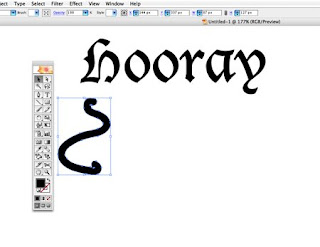
But sometimes there are parts of pre-created images that I want to animate.
Hmm...even better I can make one shape turn into another by pasting it later into the same Mask Shape. This is like Shape Tweening inside of Flash - yet without having to make a single thing inside of After Effects.
Part of After Effects' beauty, and there is a lot that is beautiful, is its integration with Photoshop and Illustrator, allowing you to import files with their layers, and even with their layer styles attached and editable inside of After Effects.

But sometimes there are parts of pre-created images that I want to animate.
Now if I am making shapes, I can always create them inside of After Effects - but frankly I still don't like to do this, even with the shape tools and shape controls inside of CS3. The benefit would be that I could animate these shapes by individual points by using the Mask Shape attribute. But with a pre-made image you can't do this...or can you?
If you make an image inside of Illustrator, you can select the path and copy it (command-C) and paste it (command-V) inside of After Effects on a solid layer, voila.
Hmm...even better I can make one shape turn into another by pasting it later into the same Mask Shape. This is like Shape Tweening inside of Flash - yet without having to make a single thing inside of After Effects.
God, I love this program!
This means you can even take things like custom symbols (like a Fish) from Illustrator and turn it into a mask just by copying and pasting.
Monday, March 17, 2008
Save a Quark 7 file as a Quark 6 file
Monday, March 10, 2008
Find out how to type special characters in OS X
Last week Kevin posted a great article on how to input nonstandard characters on your computer. Today I just found out about a piece of software that can insert characters for you, and tell you how to type them yourself. It is like Adobe's Glyph panel on steroids.
The product is called popcharx and retails for about $45. I personally have not used it, but it looks promising.
http://www.ergonis.com/products/popcharx/
*I just wanted to thank the people commenting on this post that ergois actually has a windows version of this software too called popcharwin. Thanks for letting me know!
http://www.ergonis.com/products/popcharwin/
Friday, March 7, 2008
How blogging effects your business.
Before pouncing into blog world, there's one significant item you'll need to understand - you'll need to keep up on searches. Blog comments are an opportunity to make amends or say thank you ...
For instance, here's a blog comment from Brad Winkler about an blog posting written by Russ Bickerstaff (read it here).
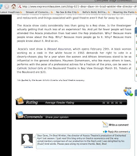
This is a blogging-good-practice. If you plan on launching a blog you should NOT monitor your comments. Instead, watch what people are saying. Make amends if they feel that something was not done ethically or in good-interest, and say thank you when they post something lovely.
This style of free-writing for your clients is the best interest for your company.
For instance, here's a blog comment from Brad Winkler about an blog posting written by Russ Bickerstaff (read it here).

This is a blogging-good-practice. If you plan on launching a blog you should NOT monitor your comments. Instead, watch what people are saying. Make amends if they feel that something was not done ethically or in good-interest, and say thank you when they post something lovely.
This style of free-writing for your clients is the best interest for your company.
Thursday, March 6, 2008
®egistered ™rademarks and ©opyrights

I just had an interesting question posted by one of our clients regarding the glyphs palette and keystrokes. They were wondering how to type a registered trademark, copyright, and standard trademark. (The common keystroke for all three is option/alt + 2 for ™, option/alt + g for ©, and option/alt + r for ®.)
The bigger question behind this though is why the glyphs palette doesn't show common keystrokes for alternate characters, especially with accents! What it really should do is give you a keyfinder option. However, this is not deemed necessary or urgent so don't hold your breath. Here is a couple of sites that will help you if you are in need of a certain key stroke: Mac OSX Keystroke Guide and Windows Keyboard Shortcuts.
©øø∂ ¬¨ç˚ (option/alt + good luck)
Wednesday, March 5, 2008
InDesign and Flash CS4 preview
Last week at the InDesign Conference in Miami, Adobe showed off a pre-release version of InDesign. It showcases an amazing ability to export InDesign files to Flash.
part 1
http://www.youtube.com/watch?v=U3-0AtqeSng
part 2
http://www.youtube.com/watch?v=Vi-MNlNqPMk
part 1
http://www.youtube.com/watch?v=U3-0AtqeSng
part 2
http://www.youtube.com/watch?v=Vi-MNlNqPMk
Tuesday, March 4, 2008
Composition Zones for Adobe InDesign
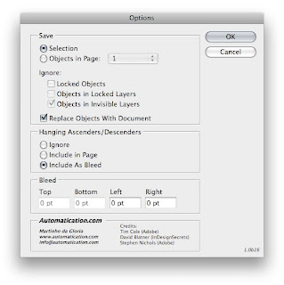
One feature of QuarkXPress 7 that has always intrigued me was composition zones. This feature would let more than one person work on one file at a time. The problem was that it was convoluted to use and inherently broken since there was no way for you to bring all aspects of the file back into Quark once you let someone else work on it.
But last week an amazing script called Layout Zones was released for Adobe InDesign CS3. This FREE scripts does everything that combustion zones does, but better. To use this script, just unzip to to the root level of your Scripts folder (Applications/Program Files > Adobe InDesign CS3 > Scripts).
Inside InDesign create a frame for the portion of the page that you want someone to work on. Select this frame and choose edit > layoutzone > Object to InDesign Document. This creates another ID document for someone else to work on. You are also linked to this file now.
Have someone else work on this ID file and when they save it, it will update on your page. Next, once your design is complete, select the linked ID file and go to: edit > layoutzones > Linked ID page to Objects, and everything comes in like you created it yourself.
This scripts is truly amazing that I hope it becomes standard inside CS4.
Here is the link.
http://automatication.com/downloads/LayoutZone.zip
Monday, March 3, 2008
A Note from Fritz
What the Heck is XML?
A lot of people have heard about XML, but they don't know what it is. XML stands for Extensible Markup Language. It facilitates the sharing of structured data across different information systems. Translated into English this means that you can move data from one form to another easily. XML does not contain any formatting information, it only contains raw data. The program that receives the XML gets to decide how the data will be displayed.
If you have a database of information it can be sent via XML to InDesign for a catalog layout, a webpage, a pdf for ebooks, and even reformatted to fit your iphone.
Another question a lot of people ask is "How do I make XML?" or "Where can I get XML". Well, it really isn't that hard. You can just type it out if your really wanted to in any text editor, but most people get it out of a database application like File Maker Pro or Microsoft Excel. In either of those programs you can either export or save your database as XML. Next you can import it into InDesign or another program and decide what you want to do with it.
Keep a look out for another 100% fresh event this April where Jim Conway and I will talk about XML and how to move your print layout to the web.
Saturday, March 1, 2008
Quick Web Tip , Part Two
Ok...just finished part one, but this second tip will be a lot quicker and less confusing.
I know whenever I am testing a site (on my Mac) I am frustrated by the fact that I cannot test on Internet Explorer, which I believe is still well over 50% of the viewing public. That is without launching Parallels, Bootcamp, or something similar. But that wastes some time, and there are some other browsers that I don't have that I should probably check too - not to mention previous versions which I have long ago overwritten with newer versions of browser.
Well fret no more, if you did before, because there is a site which will test your site on a wide variety of browsers, over different verions, on different platforms.
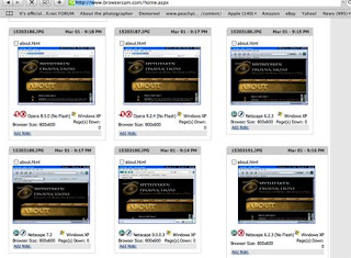 BrowserCam is an amzing website which lets you upload html, or even a site that is currently live and takes snapshots of it in the browsers that you select. I selected every browser and it gave me something like 120 different images of my about page (Mythtaken). Now when I was using the site, the speed was really slow, but the service is certainly cool.
I know whenever I am testing a site (on my Mac) I am frustrated by the fact that I cannot test on Internet Explorer, which I believe is still well over 50% of the viewing public. That is without launching Parallels, Bootcamp, or something similar. But that wastes some time, and there are some other browsers that I don't have that I should probably check too - not to mention previous versions which I have long ago overwritten with newer versions of browser.
Well fret no more, if you did before, because there is a site which will test your site on a wide variety of browsers, over different verions, on different platforms.
 BrowserCam is an amzing website which lets you upload html, or even a site that is currently live and takes snapshots of it in the browsers that you select. I selected every browser and it gave me something like 120 different images of my about page (Mythtaken). Now when I was using the site, the speed was really slow, but the service is certainly cool.
Quick Web Tips/Notes, Part One
I always find it interesting as I teach or work in my daily life, how little things that you might accidentally discover may revolutionize your workflow, or maybe add some efficiency to your practices.
While reading up more on web standards and practices, I have come upon two little neat things that have helped immensely with two headaches I have had in the past concerning website creation.
Headache #1: When working with something like a blog where you need some links to launch in a new browser - but you don't want every link to launch a new browser window.
Why a headache: Well suppose you put your blog in as a frame in your website, and it is perfect for the blog size, but external sites look really bizarre embedded in your site (beside the potential for copyright issues). But if every link opens up a new page, every internal link you have also opens a new page, leading to the potential for dozens of open pages.
Well, if you yourself are writing all the content you can always write your own targets for each link, but if you have people contributing who don't write in HTML - well, problem city.
Solution:
Part 1: Writing code that makes all links launch in a new window. Solves the issue of links appearing inside your frame - but means a new launch window for every link clicked. (I could also write this directly into CSS, but in this example, I don't have access to the CSS)
(using [ instead of < and > so it can be read not as code)
Part 2: Naming the target blank window, so that all links will go to the same window.
Now when you click on a link it will open up a new window, but all future links will open in that same window (named "display").
Neat little bit of knowledge though not hugely applicable for most situations, where you will probably write targets inline, or as CSS. But even in CSS, naming the window vs. having all windows open up is the same.
While reading up more on web standards and practices, I have come upon two little neat things that have helped immensely with two headaches I have had in the past concerning website creation.
Headache #1: When working with something like a blog where you need some links to launch in a new browser - but you don't want every link to launch a new browser window.
Why a headache: Well suppose you put your blog in as a frame in your website, and it is perfect for the blog size, but external sites look really bizarre embedded in your site (beside the potential for copyright issues). But if every link opens up a new page, every internal link you have also opens a new page, leading to the potential for dozens of open pages.
Well, if you yourself are writing all the content you can always write your own targets for each link, but if you have people contributing who don't write in HTML - well, problem city.
Solution:
Part 1: Writing code that makes all links launch in a new window. Solves the issue of links appearing inside your frame - but means a new launch window for every link clicked. (I could also write this directly into CSS, but in this example, I don't have access to the CSS)
(using [ instead of < and > so it can be read not as code)
[base target='_blank']
[/base]
Part 2: Naming the target blank window, so that all links will go to the same window.
[base target='display']
[/base]
Now when you click on a link it will open up a new window, but all future links will open in that same window (named "display").
Neat little bit of knowledge though not hugely applicable for most situations, where you will probably write targets inline, or as CSS. But even in CSS, naming the window vs. having all windows open up is the same.
Subscribe to:
Comments (Atom)
